Choosing the right colors to complement the natural beauty of wood in your home can often feel like a daunting task. Many homeowners have experienced the frustration of selecting hues that clash with their wooden floors, furniture, or architectural details, ultimately detracting from the intended aesthetic. This guide will delve into the essential characteristics of wood and the fundamentals of color theory, providing you with the knowledge to confidently create stunning color combinations that celebrate the warmth and versatility of wood in your interior design.
The Enduring Appeal and Variety of Wood in Interiors
Wood has long been a beloved material in interior design, prized for its timeless appeal, inherent warmth, and remarkable versatility. Its natural beauty brings an organic element into our living spaces, creating a sense of connection to the outdoors. However, not all wood is created equal, and understanding the nuances of different wood tones is key to successful color pairing.
- Warm Woods: Woods like oak, cherry, pine, and mahogany are characterized by their yellow, orange, or red undertones. Often found in traditional furniture, flooring, and paneling, they evoke a feeling of coziness and invitation.
- Cool Woods: Maple, birch, ash, and some lighter oaks possess gray, beige, or subtly green undertones. Frequently used in Scandinavian furniture and modern interiors, they contribute to a bright, airy, and contemporary atmosphere.
- Neutral Woods: Walnut and teak offer a balanced spectrum of undertones, making them versatile across various styles. Often seen in mid-century furniture and rich flooring, they bring a sense of sophistication and groundedness.
Furthermore, the finish applied to wood – whether natural, stained in various shades, or even painted – significantly impacts how it interacts with color. A dark stain will behave differently with a wall color than a light, natural finish.
The Fundamentals of Color Theory for Wood Pairings
To effectively pair colors with wood, a basic understanding of color theory is invaluable. The color wheel, with its primary (red, yellow, blue), secondary (green, orange, violet), and tertiary colors, provides a framework for understanding color relationships. Several key color harmonies can be particularly useful when working with wood:

- Complementary Colors: Located opposite each other on the color wheel, such as blue and orange or green and red, these pairings create high contrast, making wood tones truly pop. For example, warm oak furniture can look stunning against a cool blue wall.
- Analogous Colors: Situated next to each other on the color wheel, like blues and greens or yellows and oranges, analogous colors create a harmonious and soothing feel. This palette can be particularly effective for monochromatic or nature-inspired schemes where wood provides a grounding element.
- Triadic Colors: Three colors evenly spaced on the color wheel offer a balanced and visually interesting approach when thoughtfully integrated with wood.
- Monochromatic Colors: Using different shades, tints, and tones of a single color can create a sophisticated and unified look, allowing the texture and grain of the wood to become a prominent feature.
Crucially, paying attention to the undertones present in both the wood and your chosen colors is essential for a cohesive and pleasing result. Pairing warm-toned woods with colors that have warm undertones (like yellows, oranges, and reds) will create a harmonious and inviting feel, while contrasting them with cool undertones (blues, greens, violets) can create a more dynamic and visually stimulating space.
Best Color Combinations with Wood: Style-Specific Guidance
The "best" color combination often depends on the specific interior design style you're aiming for:

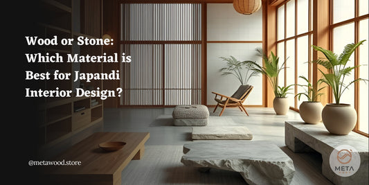
Scandinavian/Japandi: These styles prioritize light, airy, and natural aesthetics. Light to medium cool or neutral woods like birch, light oak, and ash are common. The color palette typically consists of predominantly white, off-whites, pale grays, with subtle accents of muted blues, greens, and blush pinks. These light and serene colors enhance the clean lines and minimalist nature of the style, allowing the natural beauty and subtle texture of the wood to be fully appreciated.

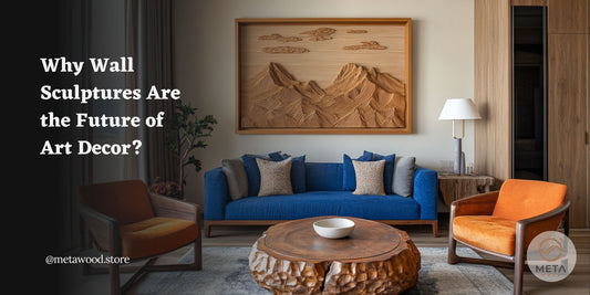
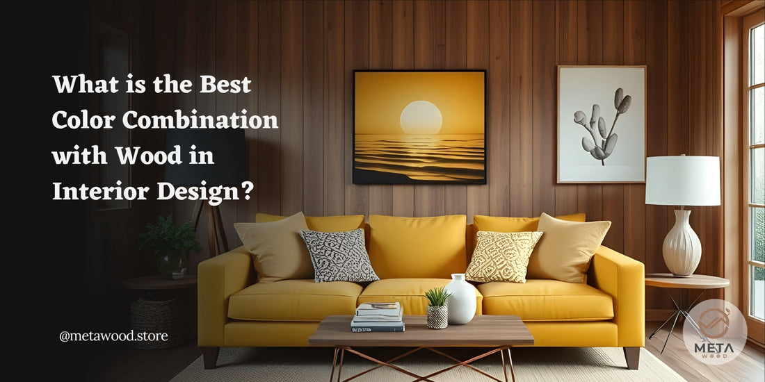
Modern/Contemporary: Modern and contemporary designs often embrace clean lines and sophistication, sometimes with bold accents. Wood tones can range from light maple to dark walnut or even ebony. Neutral color bases (grays, blacks, whites) are frequently used, providing a backdrop for bolder accents like jewel tones (emerald green, sapphire blue), mustard yellow, or contrasting oranges. These striking colors can create drama and highlight the sleek forms of wooden furniture or a statement wood wall sculpture.

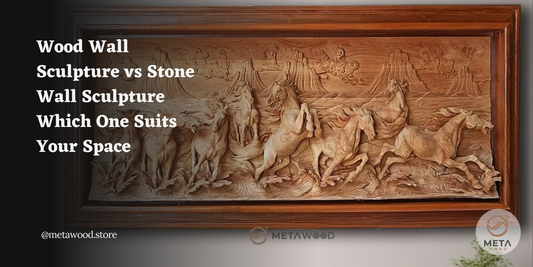
Traditional/Rustic/Farmhouse: These styles emphasize warmth, comfort, and natural textures. Warm woods like oak, pine, and cherry are prevalent. The color palette often includes earthy tones such as terracotta, olive green, warm browns, creamy whites, muted reds, and deep blues. These palettes enhance the cozy and inviting atmosphere and beautifully complement the richness and character of the wood. Textured wood relief carvings often find a natural home within these aesthetics.

Bohemian/Eclectic: Bohemian and eclectic styles celebrate individuality and layering, often incorporating rich textures and vibrant colors. A mix of warm and neutral wood tones can work well in these spaces. The color palette is typically broad and expressive, featuring jewel tones, warm reds, oranges, yellows, and contrasting blues and greens. In these colorful environments, wood often acts as a grounding element, providing a natural anchor amidst the visual richness. Unique and textured wood wall art can contribute significantly to the eclectic and personalized feel.
Final Thoughts
Ultimately, selecting the best color combination with wood in interior design is a nuanced process that involves understanding the characteristics of wood, the principles of color theory, and the specific goals of your design style. By considering these factors, you can move beyond guesswork and create stunning, cohesive interiors that celebrate the enduring beauty and warmth of wood. Remember to consider the undertones, experiment with samples, and trust your instincts to create a space that truly reflects your personal style and vision.
For those looking to further enhance their interiors with the unique artistry of wood, consider the impact of a handcrafted wood relief sculpture. At Metawood, we are a dedicated artisan studio specializing in creating exquisite handcarved wall sculpture relief from wood. Our pieces offer a timeless decorative element, adding character and natural beauty to any space. Understanding the importance of harmonious design, Metawood offers a range of wood finishes that can be tailored to perfectly complement your existing interior color palette and wood elements. Explore the possibilities of adding a bespoke wood relief sculpture from Metawood to your home and experience the transformative power of handcrafted art.